
RallyTard's STi Photo Shoot by wrxtunerd


Thread Starter
VIP Member
iTrader: (22)
Joined: Jul 2006
Posts: 9,546
From: Vacaville
Car Info: 2018 STi
what screens are you goes on?
... cuz with my lcd desktop screen they look fine and on my lap top you can see EVERY detail in the pics... if i lighten them up it looks ghey and id have to redo the hdr again.
... cuz with my lcd desktop screen they look fine and on my lap top you can see EVERY detail in the pics... if i lighten them up it looks ghey and id have to redo the hdr again.
Registered User
iTrader: (46)
Joined: Nov 2006
Posts: 8,803
From: "Streets Closed, Pizza Boy"
Car Info: www.pinoymamba.tumblr.com
Last edited by 03_Impreza_Al; Oct 26, 2007 at 01:06 AM.
Thread Starter
VIP Member
iTrader: (22)
Joined: Jul 2006
Posts: 9,546
From: Vacaville
Car Info: 2018 STi
See, i dont think that looks good in terms of light.
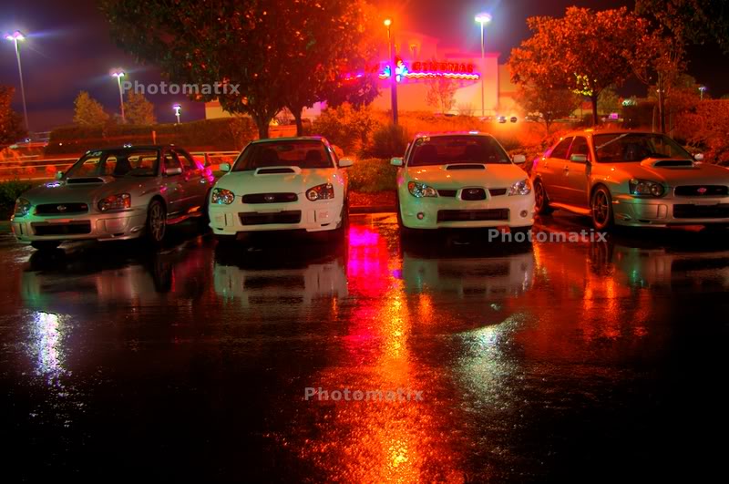
Yeah, you can see alot of surroundings, mainly the gas station roof with tons of lights that are undefined...but all of the cars look like crap. There is no definition on the front ends, which is what those looking at the picture will immediately look at.
A lot of your issue comes from using over head lighting as the dominate light source. Second, you could have zoomed in and used a lens light guard and eliminated having the out-focus-glowing white light at the top of the picture. Furthermore, you could have just gotten closer to the cars and cropped the picture while taking it by standing up close, making the cars more in focus and eliminating all the lights up top that f***ed up the picture, and if you did that using a tripod, the cars' front ends would be well detailed and in focus.
The first one is too dark/undefined on the cars themselves... How long was the shutter opened? But then again, it's also too light on the top half of the picture. In the second picture, you have too many car colors at night and it takes away the focus from the lighter colors and so theyre not in focus.
With that much lighting in the second picture you get the light reflected and unevenly distributed on the cars.. i.e. the 06 whited out and the blue 04-05 with the roof issue.. the black bugeye looking hazy and fuzzy, and then the RS looks a little more in focus... why? because it's darker! none of the others are in focus and too much light makes it way obvious. too much light in the picture.
I wanted my pics dark and focused.
Last edited by medicSTi; Oct 26, 2007 at 10:35 AM.
Thread Starter
VIP Member
iTrader: (22)
Joined: Jul 2006
Posts: 9,546
From: Vacaville
Car Info: 2018 STi
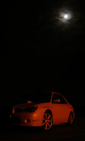
Alright, here's what I mean:
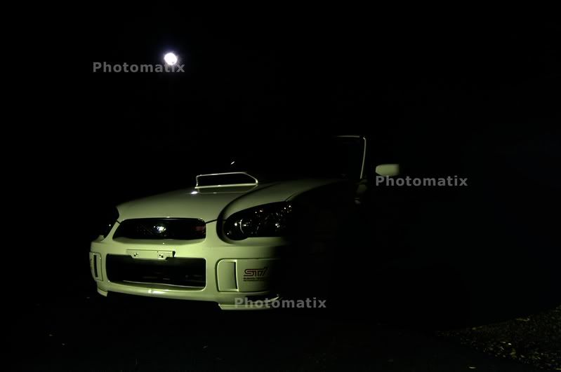
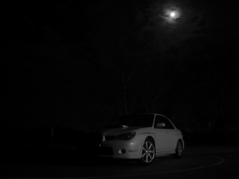
This shot is meant to be dark, allowing you to ONLY see the front end of the car, the tree, and the moon. The parking lights on make it stand out in the dark and it's a mysterious picture... plus the moon is in the background giving it some balance in terms of light and dark. It is meant to be this dark:
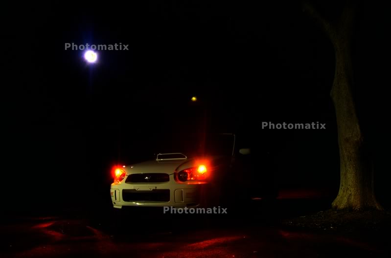
This shot is similar to the first, yet without the parking lights on, allows the car to come off as Aspen White, like it is. The goal was the same as the above photo and it is supposed to be dark and NOT allow everything to be seen. i.e. I had him pull the car up into just enough light to allow the whole hood scoop to become defined.

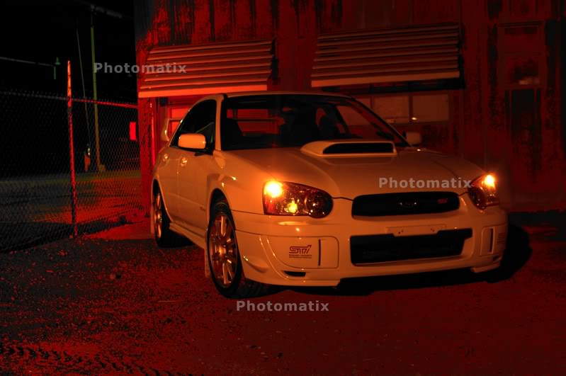
This photo has a lot more color on a bright screen, mixing in greens and an alien like brownish red on the dirt through the fence. It's lighting came out as I intended.
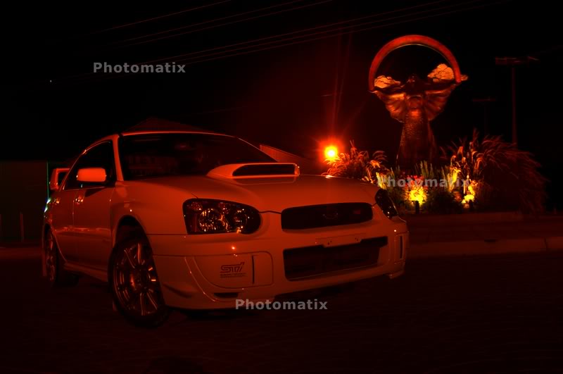
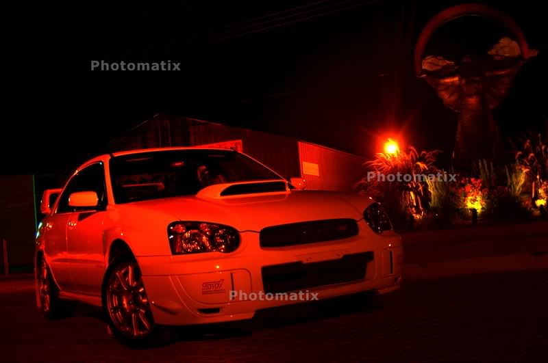
The following shot is the only one I really like of the four below in terms of light, the AW begins to get washed out with red do to the tone mapping I did when I converted the pictures to HDR.
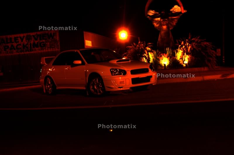
The lighting on the first one come out as intended, yet I didn't really want the statue completely in focus because it would take away from the car, but it may have looked better in complete focus even if it took away the emphasis being on the car.
I don't like the three following pictures and since it was two in the morning and the only light out was the moon and a few street lights since we were 20 minutes from the city out in the country, the fact that I got this much light was amazing, even though I don't think these three look good. Yes, in a parking lot in the middle of the night you can get TONS of light, but in the cuts with no light except the moon and a street light, you've got to earn the light
This picture is tone mapped and the AW got washed out with red, also making it blurry. It's crap.
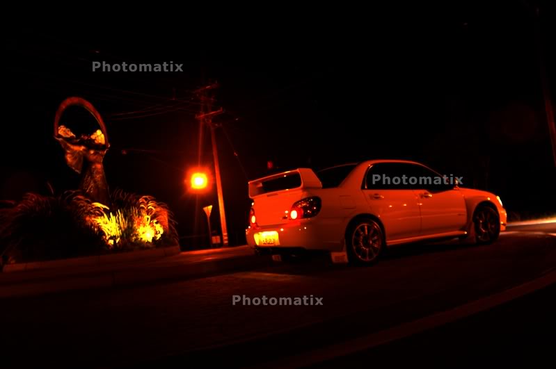
This picture is crap due to the distance from the car and the lack of light in the cuts. Also since we wanted to show off Lorin's JDM tail mod. It's crap, but would make a nice sunset/day shot.
This picture is crap due to distance and a lack of light, making it blurry.
All explained and hopefully understood. Playing with tone mapping and making it look good can be hard, but like in the first four pictures you can get what you want if you have the right lighting, allowing focus and clarity... the last three are nasty and I just posted them to show the tails and more of the statue.
-werd
This shot is meant to be dark, allowing you to ONLY see the front end of the car, the tree, and the moon. The parking lights on make it stand out in the dark and it's a mysterious picture... plus the moon is in the background giving it some balance in terms of light and dark. It is meant to be this dark:
This shot is similar to the first, yet without the parking lights on, allows the car to come off as Aspen White, like it is. The goal was the same as the above photo and it is supposed to be dark and NOT allow everything to be seen. i.e. I had him pull the car up into just enough light to allow the whole hood scoop to become defined.
This photo has a lot more color on a bright screen, mixing in greens and an alien like brownish red on the dirt through the fence. It's lighting came out as I intended.
The following shot is the only one I really like of the four below in terms of light, the AW begins to get washed out with red do to the tone mapping I did when I converted the pictures to HDR.
The lighting on the first one come out as intended, yet I didn't really want the statue completely in focus because it would take away from the car, but it may have looked better in complete focus even if it took away the emphasis being on the car.
I don't like the three following pictures and since it was two in the morning and the only light out was the moon and a few street lights since we were 20 minutes from the city out in the country, the fact that I got this much light was amazing, even though I don't think these three look good. Yes, in a parking lot in the middle of the night you can get TONS of light, but in the cuts with no light except the moon and a street light, you've got to earn the light
This picture is tone mapped and the AW got washed out with red, also making it blurry. It's crap.
This picture is crap due to the distance from the car and the lack of light in the cuts. Also since we wanted to show off Lorin's JDM tail mod. It's crap, but would make a nice sunset/day shot.
This picture is crap due to distance and a lack of light, making it blurry.
All explained and hopefully understood. Playing with tone mapping and making it look good can be hard, but like in the first four pictures you can get what you want if you have the right lighting, allowing focus and clarity... the last three are nasty and I just posted them to show the tails and more of the statue.
-werd
Last edited by medicSTi; Oct 26, 2007 at 10:25 AM.
Thread Starter
VIP Member
iTrader: (22)
Joined: Jul 2006
Posts: 9,546
From: Vacaville
Car Info: 2018 STi
See, darkness FTW!
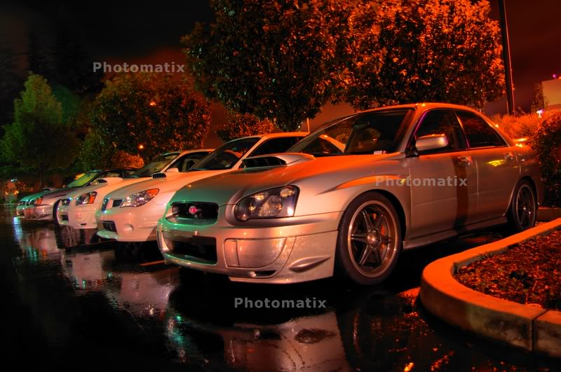
Our FFBN Meet last week in HDR again.
This one is perfect in terms of light.
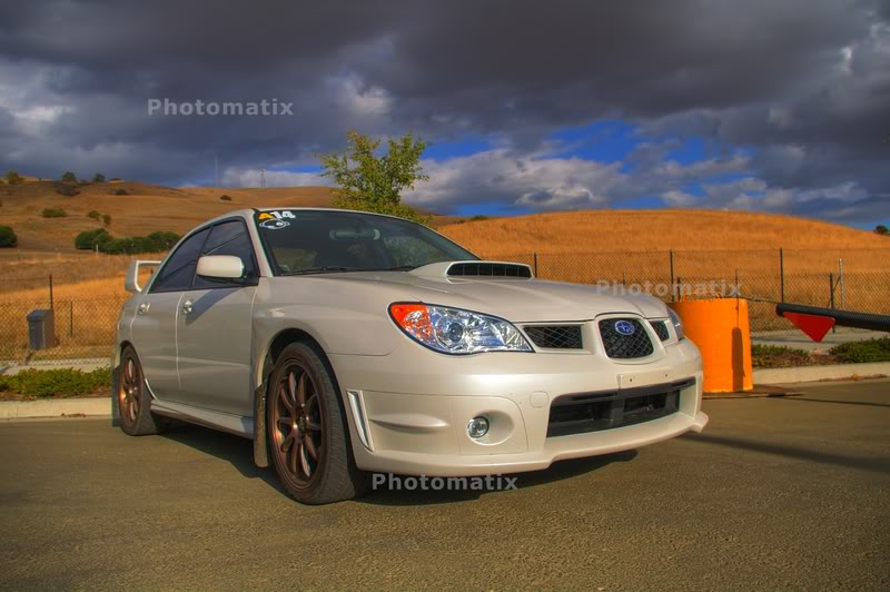
My car with a daytime HDR shot, with perfect lighting and appropriate focus:
See, this picture is ruined by too much lighting, it should be darker, which would make it less grainy and more in focus.
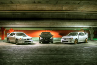
A shot in a parking garage... but pushing it in terms of too much light:
Our FFBN Meet last week in HDR again.
This one is perfect in terms of light.
My car with a daytime HDR shot, with perfect lighting and appropriate focus:
See, this picture is ruined by too much lighting, it should be darker, which would make it less grainy and more in focus.
A shot in a parking garage... but pushing it in terms of too much light:

Thread
Thread Starter
Forum
Replies
Last Post
medicSTi
NorCal Classifieds
21
Aug 29, 2007 01:10 AM
medicSTi
Ongoing Projects
2
May 21, 2007 02:33 PM