View Full Version : Vote for i-Club Logo!
Imprezer 02-24-2003, 07:07 PM Hello,
After days of thinking, I narrowed down the submitted logos to the final 3. It wasn't easy, as I know lots of you put a lot of efford into that. I really appreciate it.
Here is what I took into the consideration:
1. Clear representation of "Subarism"
2. Easy to read
3. Easy to cut (stickers)
4. Original
So, here they are:
Please vote:
A
http://www.i-club.com/images/logo/newlogo1.jpg
***
B
http://www.i-club.com/images/logo/newlogo2.jpg
***
C
http://www.i-club.com/images/logo/newlogo3.jpg
Thank you to everyone who participated in this. Great job all of you!
1fastGC 02-24-2003, 08:32 PM I voted for A.
ImprezaRSDriver 02-24-2003, 10:04 PM Originally posted by 1fastGC
I voted for A.
Same here.
Kevin M 02-24-2003, 10:15 PM 
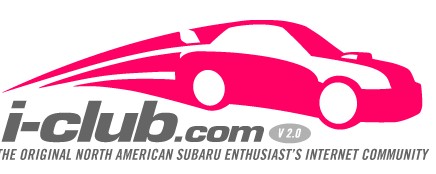
I like the look of all three. C is kinda hard to read for the uninitiated though... could say "i-dub" haha. I like the unfinished look of B though... since i-Club is also going to be constantly improving, it seems fitting. Any is a good choice though. Only one thing.... how can v 2.0 be the "original" anything? :p
Forestar 02-25-2003, 12:54 AM I like the first one, but not the color. Can't it be a RALLY blue?
mattr762 02-25-2003, 09:43 AM I vote for B. Clean, Conservative, looks good as a sticker on a car.
A - Perspective is off, swoosh lines are weird, standard boring font and not Conservative enough for us boring folks. It's to over powering as a sticker on my white car.
C - Costs a lot more to make into a sticker with the blend.
dorrington 02-25-2003, 10:31 AM to be honest, i think we need more choices. Until then i'm voting for A
kandykid 02-25-2003, 10:33 AM i voted for the first on but i hope they can make a yellow or blue
subarugirl 02-25-2003, 11:20 AM I really like choice A but I agree w/ kandykid about the color. Even though I'm a girl and I like pink, I think blue would be a more appropriate color or maybe a combination of blue and yellow.
Nice job who ever made it!
zullard 02-25-2003, 11:33 AM B looks good
eastbaysubaru 02-25-2003, 12:06 PM The first logo looks too much like the logo from the "other" site. I like the third, but it will be tough to make into stickers.
-Brian
Keisatsu 02-25-2003, 12:25 PM I like them all alot, but A looks a LOT like the "old" iclubs logo...
B looks very clean, and i also like the unfinished look, this logo would make a VERY nice decal... this is the one I voted for...
c is very nice but like BAN SUVs said it could say "i-Dub" for the uninitiated, then people would think we were a Volkswagen club...
Keisatsu 02-25-2003, 02:09 PM although on thing on B...
It doesn't show the url anywhere, the others have I-club and then .com integrated into the logo, b needs that i think...
see what im sayin?
RSEnigma 02-25-2003, 02:27 PM i say C, a just doesn't do it for me an although i do like B its too COBBish. so i say C :)
Imprezer 02-25-2003, 02:29 PM I personally like the A, because it is a remake of the old i-Club logo and it doesn't "represent" any particular generation of Impreza. It even represents the Legacy since the general shape of the car image is very Subaru-like.
I know everyone has therir own tastes but I personaly can not stan A. I like B alot better, but to be honest I dont care for any of them all that much.
flowerpower 02-25-2003, 05:14 PM I like A!!!
Gotta say I'm not crazy about any of these, but hey, I don't like that other site's new logo either :P
Push comes to shove, B, but I'd much rather hold out for another round of picks!
The designs all look good but non of them would get my vote...I say we have more choices...
areg
Acadian 02-26-2003, 03:40 PM Originally posted by areg
The designs all look good but non of them would get my vote...I say we have more choices...
areg
Agreed....
I like black and white/silhouette type logos...but none of those float my boat.
It also has to be a wagon!! ;) just J/k
WRX34 02-26-2003, 04:12 PM As an advertising design student I like the use of brush/strokes in B and C...but the spoiler bugged me in one of those and well...I love the new STI/WRX bodystyle with the old logo look in A...A gets my vote! V2.0 baby! Whoo hooo!
Oh and by the way...B would be a biotch to "weed" for decals ;) I HATE weeding those decals with small cuts in them! It just sucks...plus they peel off easier. :(
WRX34
GumbieAK 02-26-2003, 09:01 PM i like B
would make a good sticker
Imprezer 02-26-2003, 11:50 PM Don't worry about the colors.
The colors are not final.
General shape and form is.
Also, don't worry about the small text. Just the main part.
I went for B. :D
A looks like the old logo. Personally I'd like to move away from that, if you know what I'm talkin 'bout. :p
C is cool, I like the car profile but the text is a lil wierd..
Awesome job to everyone!
Brandee
PAbluwrx 02-27-2003, 10:42 AM looks good just needs to be a different color scheme
Elite421 02-27-2003, 10:52 AM I think A looks to much like the old Logo, and i'm a fan for somthing new.
B reminds me to much og Cobb Tunnings logo.
And I acually like C a lot but i think it needs something more but has great potential. I do see how i could cost more to have a sticker made out of it, but we dont have to have the stickers look excatly like the logo.
So my vote is for C.
Alex
mattr762 02-27-2003, 12:15 PM B reminds me to much og Cobb Tunnings logo.
I think someone need some glasses.
http://www.cobbtuning.com/images/logo.gif
http://www.i-club.com/images/logo/newlogo2.jpg
Choice B and the Cobb logo look nothing alike.
Elite421 02-27-2003, 01:44 PM ok Jackass. i was refeing to the one that they use in ads sometimes! and that is on the bottom of this plate cover and on the back of there shirts
I think someone needs to do some research before making rude coments!
you can go back to playing in your corn fields now
http://cobbtuning.com/impreza/images/licenseframe.jp
Kevin M 02-27-2003, 03:33 PM You mean:
http://cobbtuning.com/impreza/images/licenseframe.jpg
But as far as I'm concerned, I say steal it until Trey sics his lawyers on us Alex!
mattr762 02-27-2003, 03:46 PM Orginally posted by Elite421:
Hi my name is Elite421, and I am a retard. I don't even know how to close an image tag.
PhillyScott 02-27-2003, 03:47 PM I like "A" the best, but using blue instead of the pink would be better, in my opinion. "B" is not bad either, but I think you would need to add some color and the ".com" in small letters after the i-Club.
my $ .02,
_Scott
david2z4 02-27-2003, 04:13 PM A is Gay. It is old news, worse than the original, this is a new site, lets have a whole new design that is not just a compromize but a step foward and something we can be proud to display.
B looks unprofesional ragged and just not refined enough
C by far is the most profesional looking, completely new and original, and is leaning toward were I think the impreza is heading in the future.
Zoeb2s 02-28-2003, 11:12 AM I voted B....I not wan't a pink sticker on the side of my car!
my25rs 02-28-2003, 12:46 PM my vote is for A
Astacun1 03-01-2003, 04:18 PM Voted for B. Clean and simple. Should look good in most car colors.
oEcKo_UnLtdo 03-01-2003, 08:13 PM 2nd ones PIMP
Wingless Wonder 03-02-2003, 08:24 AM Choice 'A'. Please change the color to something similar to WRB, or anything other than pink.
--
^ww^
"…axles of evil…" - George W. Bush
Elite421 03-03-2003, 04:51 PM mattr762- Sorry if im not an online nerd. Your 10+ years older then me and your acting like your a twleve years old....some people never mature. :rolleyes:
AdoboUaReX 03-03-2003, 05:50 PM maybe we can combine A with B? i like the lettering of A and the silhoute of B.
but like a lot of people said, i'd like to see the other designs because non of these really look any special.
subaruwrx511 03-03-2003, 07:04 PM i like A, if you want to make that color for a sticker that fine but i wont have one, can we get colors in it. blue, siver, white. that way we could match them to our cars????
Imprezer 03-04-2003, 07:00 PM Stickers will be available in all basic colors. The final logo will be "prettied up".
So far looks like the "A" is winning. I will wait until the end of this week to see if any of the other designs make a come back.
Kevin M 03-04-2003, 07:43 PM Why not just declare multiple winners? Each one looks pretty easy to make, so why not let us pick for ourselves? it seems more in the spirit of the 'new' i-Club to have a little more autonomy and individuality.
Imprezer 03-05-2003, 12:31 AM Have multiple logos?
Not a good idea. I will have few variation of the stickers, but they will be based on the winning logo.
Iceman0321 03-05-2003, 12:58 AM Great Jobs,
I really like them all but the last one looks more of a furious look and sharp. If it would the outline be ralley blue or yellow then it would look tight but all of them are great i picked 3C.
WRXSTIle 03-05-2003, 03:49 AM I'm going with C and I'll create several bogus ID's to get it to the top if I need to!
WRXSTIle 03-05-2003, 03:51 AM wow Ive got alot of work to do.
RallyX 03-05-2003, 07:10 PM I would prefer WRC blue as well.
Dewey 8d 03-06-2003, 01:25 AM Toss up between "A" or "C" for me. I would be more than happy to put any of them on my hooptie, though!
NAZTTy 03-06-2003, 11:05 AM Nice job on all 3 - very creative!
WizzD 03-06-2003, 06:21 PM I like A but not the color. If it can be made into any colors for stickers for our cars then I don't care. As long as you can make stickers like that and not that color.
Phil Chapman 03-07-2003, 02:44 PM I choose B, but with a cleaned up line instead of the "crayon" look, and use the font from A.
Cosmo 03-08-2003, 09:13 AM Well, while I missed the thread asking for submissions, when it comes time to get your decals, let me know. I bet I can beat just about any other price you've received...
highlander68k 03-08-2003, 02:39 PM I would like to vote for A but it won't let me
Imprezer 03-09-2003, 03:29 AM The tribe has spoken...
;)
A it is.
Now, I need to have it finalized and get stickers done for you guys.
Thank you for your participation.
- Alex
You schould also just make one that says "i-Club.com" in block letters like the one above also.
wrxxxr8d 03-10-2003, 01:04 AM I would like to say that LOGO C is a much simpler, defined logo. It is straight to the point and is not to "computer geeky." The other two are just a little too much. There is no need to put that much words on the logo. With C, you are supporting the club and could inspire questions from enthusiasts that may ask what it stands for and you can have a conversation with them. Also, the pink represents the STi well. That is my take on the logos and I voted for C, obviously. Thank you for taking your time to read this...
wrxxxr8d
wrxxxr8d 03-10-2003, 01:16 AM Well I guess I am a little late on my 2 cents. I guess I will not be getting a sticker when they are made...maybe sombody out there can bootleg som that are a little more simple, we do not need to get placed in the same category as the "Got Rice" crowd. Peace and S**T
wrxxxr8d
Imprezer 03-10-2003, 10:42 AM we do not need to get placed in the same category as the "Got Rice" crowd. Peace and S**T
Please explain what you mean.
wrxxxr8d 03-10-2003, 11:03 AM I was referring to those stickers on the Hondas and Acuras out there that use the the slogan "got milk?"
wrxxxr8d
steeo 03-10-2003, 12:17 PM A little late aswell but "C" looks good, it's clean and simple and looks a lot better than the other 2 cause of all the writing.
The first one is too formal looking and the second one i don't know it doesn't appeal to me but the 3rd one as soon as i saw it, it jumped out at me as something that i'd put on my scooby
Kevin M 03-10-2003, 09:09 PM So what's so bad about just lettig us each choose from the 3? It wouldn't cost anymore to run any of them, and I can't see any reason why we need uniforms. Kinda the spirit of this place has been the individuality of the members, we're not all trying to be the same. I have my preference, but I'd still like to see peoples with their own preference on their Scoobs. Plus, every choice has had several people specifically say they don't like it... which means less of us will actually buy one, which means less chance of random spottings and what not.
Flat4Turbo 06-22-2004, 02:47 PM I said A but I would like a differnet color than pink.
gdogg 06-22-2004, 04:37 PM IMO
A= nice but a little busy
B= blah
C= huh?
i voted A. . . but i would like to see other choices if available.
aloha from the summit of Mauna Kea
SpeedRevelation 06-29-2004, 05:39 PM I think A is the best out of the 3. Looks sick in the red/pink!
B looks unprofessional as if someone just drew that in 10 seconds (no offense to whoever made it) just not my cup of tea.
C is ok, but why have C when there's A?
blue blurr 07-03-2004, 06:50 PM a is the best out of the three, but... not pink make it a differnt color... maybe blue??
estrada42 07-04-2004, 02:24 AM Voted of A, but sad to see no wagon love, nor any GC love.
esracer 07-06-2004, 07:38 AM I voted for b, it looks really sweet.
Zoeb2s 07-28-2004, 11:00 AM lol wtf...look at the date of this thread ;)
the old logo (A) has already been used and there is a new logo now:
http://www.i-club.com/forums/imagize/misc/headerl.jpg
OneManArmy 08-13-2004, 03:49 PM wow...old thread...
I didn't vote cause I didn't really like any of them...but A...the old one is the best.
glad it stayed that way.
WindingRoad 08-17-2004, 11:35 AM I'm still for the old logo.
WindingRoad 08-17-2004, 01:11 PM oops, i didnt realize that this was so old
need4sti 09-05-2004, 12:33 AM i like the A & C logo bet i voted for the more original A
FoToHo 09-07-2004, 01:23 AM I vote for A cause it is clean and simple and has crisp lines!
miranda
AWD 20T 09-09-2004, 08:09 PM Guys, the vote is over!
i vote A, but what about this one for wagon wrx?
http://www.i-club.com/forums/attachment.php?attachmentid=28237&stc=1
Salty 09-17-2004, 02:47 PM http://img.photobucket.com/albums/v282/sierra11b/Emoticons/iamwithstupid.gif *with an "s" in this case*
My_Red_Suby 09-17-2004, 03:01 PM A - just the picture the the, take the bottom part out
i went ahead and closed this poll since we are on a few designs past the purpose of this poll.
ur mom 03-20-2005, 06:46 PM B dood
I vote A, but I think the color should be blue.
Project Worx 03-20-2005, 10:38 PM neither =)
1st fruity
2nd by a kid
3rd looks like a shark =)
subabu05 03-23-2005, 04:15 PM I agree that "A" is the best, but it should be blue not red.
thunder_sti 07-13-2005, 12:18 AM I like A but with the same colors of the 3RD....that would be really nice....
WRX409 07-25-2006, 06:32 PM A. for sure looks the best.
|